Configure App Groups
Click on a chart title within the dashboard to automatically generate a LiveNX PfR flow report. Mouse over the bar of interest to get tool tips, including the value of each segment in a stacked bar.
The PfR dashboard charts alerts, site, application group and service provider statistics in either the Inbound or Outbound direction. Click on either Inbound or Outbound to select the direction; default is Outbound. The charts compute statistics for the last 15 minutes, 30 minutes, 1 hour or 4 hours. Click on 15m, 30m, 1h or 4h to select the duration. The date and time values below the duration selection indicate the start and end times of the charted data.
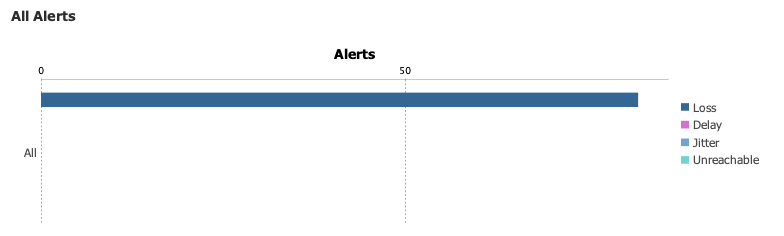
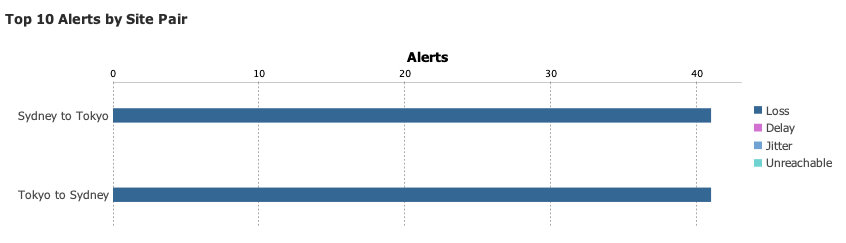
There are two charts in the Alerts section of the PfR Dashboard: All Alerts and Top 10 Alerts by Site Pair. PfRv3 supports four alerts: Loss, Delay, Jitter and Unreachable.
All Alerts charts the total number of alerts for the system in a stacked bar chart format, color-coded to indicate the four types of PfRv3 alerts.
Top 10 Alerts by Site Pair charts the top 10 site pairs that generate the largest number of alerts. The alerts are charted in a stacked bar chart format, color-coded to indicate the four types of PfRv3 alerts. The sites are device level attributes that are user-defined in the Device/Interface tree view. Defining sites is described – BasicSetup.
There are three charts in the Site section of the PfRv3 Dashboard: Top 10 Alerts by Site, Site Utilization by Application Group, and Site Utilization by Service Provider.